We are living in a world where communication is increasingly visual. Growing up, with one television in the house, I may have spent about one to two hours in front of a screen, but now we not only have one (or more) televisions, we also have screens on our computers, on our tablet devices and even on what what traditionally an aural device, our phone. We spend time looking at computer screens during our work day, ride home on the bus staring at our phone screen, and sit on the couch with our iPad in hand, in front of the larger television screen (well, I do!). We consume videos, memes and scroll through thousands of photos on Instagram or Pinterest. Increasingly, getting your message to stand out in an ocean of information requires an arresting visual – and as we become more sophisticated consumers of visual content, boring presentations with long bullet lists of text are no longer acceptable.
However, we aren’t all trained graphic designers, and creating amazing graphics is not something many of us have the time to do. Enter Visme, a presentation and design app which I have had the pleasure to try during the past few weeks.
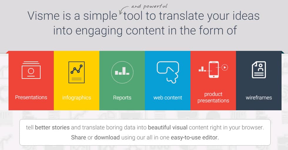
Visme is a multi-tool–coined “The Swiss Knife of Visual Content”–because although it’s mainly used to create engaging presentations, infographics, web banners and short animations, the possibilities it affords are endless. If you are short on time (or ideas!), you can start from a preset of professional templates or, if you already know what you want, start from a blank canvas and create exactly what you need.

It is terrific for creating presentations, as the file is automatically saved, and accessible on any device; as long as you have an internet connection. Not only is designing the slide content easy, it has presentation tools that allow you to see the upcoming slide, notes for each slide and a timer to keep you on track. For a really good overview of what Visme can do when you are creating a presentation, check out this comparison with PowerPoint.
Another very cool thing about Visme is how easy it makes creating impressive looking charts for the presentation of data. They can even be animated!
Creating charts is always a challenge for me, but including statistics in reports and presentations is often unavoidable. In my previous role as a librarian, my manager was always impressed when I could present a slick looking infographic that he could table at meetings with the ‘higher ups’. However these infographics took a lot of blood sweat and tears as I struggled to convert the numbers from my library management system report into a graphic that looked cool! Visme makes this process incredibly easy, and offers a range of ways to present data. Animation is often built in, so if you are presenting your stats in a presentation, it looks even cooler, but with minimum effort!
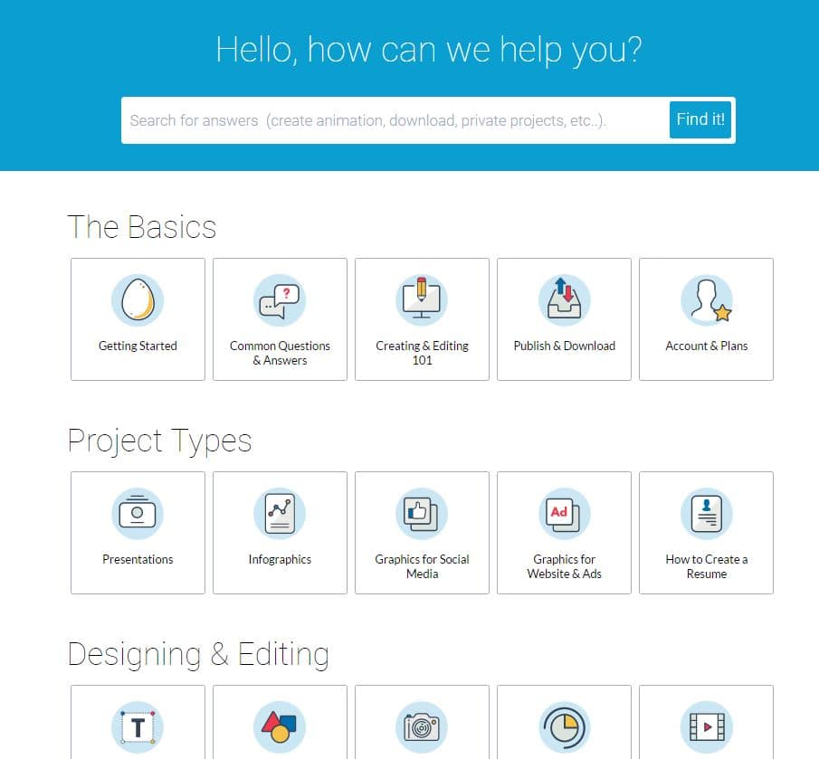
I haven’t included lots of how tos in this review, because Visme takes care of that too. As I said earlier, it is a very easy tool to navigate and learn, but if you run into trouble or need direction, their help page is a dream. And, if you are really stuck, you can contact them directly using the form, and they will get back to you asap. Here’s a screen grab of how the help screen is laid out: it couldn’t be easier.
Like every web tool, Visme is a work in progress – however it is obvious that a lot of thought and planning has gone into creating a tool that meets the needs of busy people who want their work to look eye-catching. In the few weeks that I have been using Visme, I have noticed that sometimes there can be a tiny bit of a lag between when you click and when something happens – but I think that this may be an internet thing, rather than a tool thing. Sometimes my brain runs ahead of my internet bandwidth! However, overall, I have really enjoyed using this tool. I’ve created a slick looking presentation (which I will share once I have presented it at a conference in late June), an information flier to go with the presentation, and two infographics – and I’ve been thrilled with them all. You can see the two infographics I’ve created below. I adapted templates that were already provided, and found it easy to add in my own information as I needed. As I embedded these infographics, if you move your mouse over the bottom of them, a popup banner will allow you to see them fullscreen.
Created using Visme. An easy-to-use Infographic Maker. ActionResearch
Created using Visme. An easy-to-use Infographic Maker. Design-basedvsActionResearch
So there you go! Check out Visme! It makes it fast and easy to create stylish and modern visuals.
Disclaimer: I was provided with a free ‘Complete’ Account by Visme to trial. All thoughts and opinions expressed in this post are my own, and not influenced by the developing company and/or its affiliates in any way.


